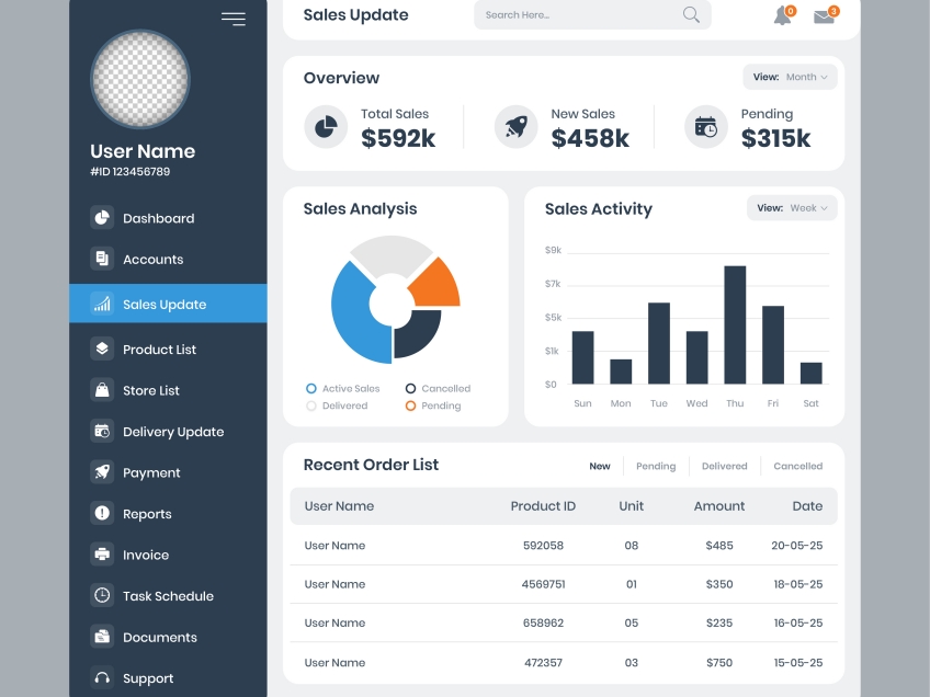
Financial Dashboard

Project Overview
Managing business and personal finances can be a tedious and overwhelming task, often involving complicated figures and tables. A financial dashboard addresses this problem by transforming numbers and tables into visual-friendly charts and figures, enhancing the decision-making process.
Challenge
The main goal was to create an interactive dashboard with real-time chart updates based on securities selection. The challenge was to balance data granularity with simplified visualizations to ensure clarity without losing essential details.
Methodology
- Data Analysis: Explore the structure and range of data to be visualized.
- Visual Design: Develop a dashboard prototype with an appropriate color scheme and component layout.
- Implementation: Build the dashboard based on the finalized design.
- Deployment: Allow access to the dashboard via cloud services.
Tools
The project employed Plotly Dash and Pandas in Python, utilizing the Yahoo Finance API for securities data. Git and GitHub were used for version control and collaboration. Testing and deployment were assisted by continuous integration/continuous deployment (CI/CD) practices. The Google Cloud Platform (GCP) was utilized for cloud deployment.
Results
The final outcome was an interactive financial dashboard with real-time chart updates based on securities selection. A summary table of assets, income, and expenses was included to retain essential data granularity.